Monument Snowboards
Graphic Illustration
These graphics were designed for the launch of Monument Snowboard's 2016/17 snow season.
Combining elements of quirky character design, old-school retro newspaper graphics and urban street art, this style paired seamlessly with the 'skateboard feel' of the board itself.
https://goo.gl/PlPjsL
Project Beer Bros packaging design
This presentation showcases our design and illustration work for The Beer Bros. limited-edition range of craft beers, 'Dark 'n' Dirty, Antique Willy & Balding Fish'. The design is a deliberate dichotomy that uses a classic retro aesthetic. It harks back to the 'gentlemanly' days of civilized drinking; but also uses text and headlines which poke fun at indulging in its excesses. The text was taken from old tabloid headlines & pull copy and juxtaposes them in a way that makes the resulting visual blend a comedy of dubious ambiguity and puzzling rhetoric.
Keeping in the theme of 1960's iconography, we used 3 retro-inspired mascots (All named 'Hoppy McHopface'– in itself a reference to Australian pop culture) to represent the 3 beers in the range. Each one was designed with a similar feel– smartly dressed, wearing a crown and bowtie, while each one is shown doing something related to the background text.
We also developed further promotional POS material using variations of the can graphics to extend the reach of the brand.
Australian Centre of Trauma and Wellness
Walker Design Co. was hired to design the brand identity and architecture for a newly created psychology practice located in Victoria, Australia specializing in the abatement and recovery of mental trauma.
The client required a strong brand presence amongst its peers within the industry. Through the use of strategy and research, we developed a brand story that is softly spoken, human and approachable yet dominant, bold and immediately recognizable.
The logo is built as the visual cornerstone of the company values of compassion, integrity and human-centered. The identity was to flow through to the stationary as well as advertising collateral, signage, and the company website.
Project Beer Bros packaging design
This presentation showcases our design and illustration work for The Beer Bros. limited-edition range of craft beers, 'Dark 'n' Dirty, Antique Willy & Balding Fish'. The design is a deliberate dichotomy that uses a classic retro aesthetic. It harks back to the 'gentlemanly' days of civilized drinking; but also uses text and headlines which poke fun at indulging in its excesses. The text was taken from old tabloid headlines & pull copy and juxtaposes them in a way that makes the resulting visual blend a comedy of dubious ambiguity and puzzling rhetoric.
Keeping in the theme of 1960's iconography, we used 3 retro-inspired mascots (All named 'Hoppy McHopface'– in itself a reference to Australian pop culture) to represent the 3 beers in the range. Each one was designed with a similar feel– smartly dressed, wearing a crown and bowtie, while each one is shown doing something related to the background text.
We also developed further promotional POS material using variations of the can graphics to extend the reach of the brand.
Hearth Personal Care Services logo
At Hearth Personal Care Services, they provide the highest standard of personal care for Australians with a disability. Professionalism, compassion and the needs of the individual are at the heart of everything they do.
Australian television has gone from strength to strength in recent years. That's why when we were approached by Gristmill to design the key graphic for season 3 of Upper Middle Bogan, we jumped for joy.
The brief involved designing the visual look including type treatments, colour usage, wordmark design as well as the creation of usage guidelines which allowed pay tv companies to produce their own GUI artwork based on our original design.
Lorum ipsum dolar venit William servo ubi est cani o sed innit. Canio sed puellam dormit. Lorum ipsum dolar venit.
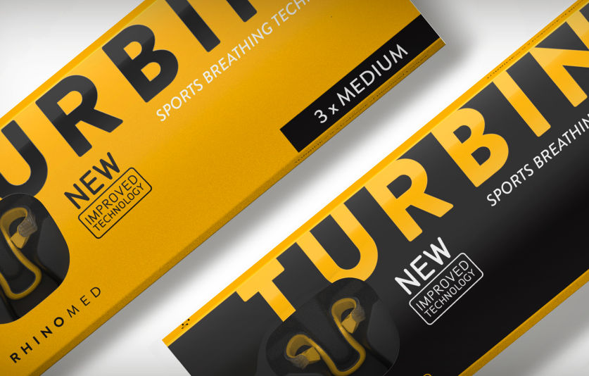
Resmed Turbine packaging
We were asked to redesign the packaging for Rhinomed’s Turbine. A revolutionary new breathing device for athletes.
Agency: By All Means